Re-branding International School of Lausanne

At the start of this school year, the International School of Lausanne launched their new logo, together with a new website. ISL Head of Marketing, Hervé Petrequin, gives his insights to us about why now is the time for a fresh start and how they did it.
Change for the sake of change is not a good reason to have a new logo. Our school is changing, and therefore we felt the need for a new representation of who we are, a truly international community and an institution that’s constantly evolving.
Why a new identity?
We felt that our old logo no longer reflected who we are. ISL is a vibrant community of more than 60 nationalities. We wanted our logo to reflect that dynamism. We needed a modern graphic way of representing our community without falling for the clichés of international schools.
The new logo shows collaboration and connectedness of the school community, all here for the purpose of delivering superior quality education to its students.
Our old logo was also tricky to place correctly. The 3 colours made it difficult to have the right colour across different mediums. It became especially challenging when using the logo on a coloured background.
Tell us a bit about the process?
We started with a great deal of research. We spent time understanding our community, our families, students and teachers. What makes the ISL community unique? We also led several interviews with parents and various internal workshops.

We worked intensively with members of our community to better translate what makes the International School of Lausanne what we are. Our messaging improved by simplifying it and choosing a language that is closer to our families and community.

We also benchmarked against other schools worldwide to understand how schools represent themselves.
Did you use any external partners?
Yes, to bring fresh perspectives and best practices into the project, we worked with a branding agency in Switzerland to visualise what it means to be a welcoming learning community, inspiring restless curiosity in our students.
We also worked with web experts.
What about the Typography?
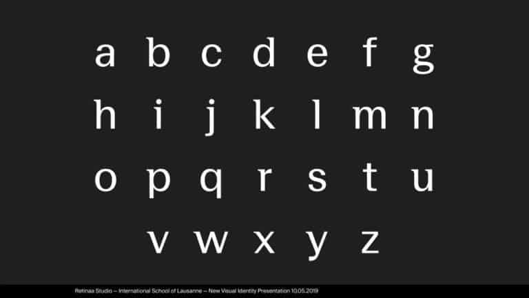
The font is completely new and custom made in order to reflect our school personality. We created a semi-serif that has an academic feel but is also truly contemporary.
How does the logo reflect the International School of Lausanne Community?
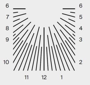
The logo is composed of the custom font and a symbol. The Logomark is constructed by three layers of interwoven rays, depicting the interconnection between the school, the parents and the students.

But that’s not all. If you cut the circle to make a square out of it, it becomes reminiscent of a sun quadrant. The idea was to represent the hours of the day we spend together at school.
What about the colours?
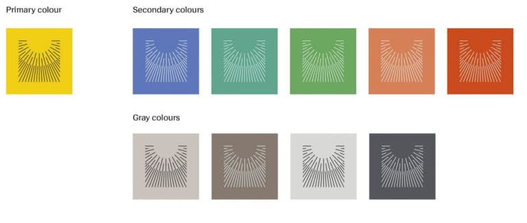
The colour palette is simple and the different colours reflect the variety of people at school.
Tell us about the new website?
We started the website and its content from scratch. Designed from the ground up and “mobile-first”. If you visit the website now you will see a huge improvement in usability. We have also created new features such as People of ISL to tell the story of our community.
What have you learnt from this exercise?
- Don’t just jump on a design, the logo is the last piece of a rebranding. First, understand what you want to achieve. Write about it, take the time to reflect.
- It is important to listen and take constructive criticism from people inside your organisation. But don’t try to please everyone.
- Select the right partners. We chose experts from outside the education field to get a fresh perspective and achieve our unique look.
- Tell the story. A logo is nice, but we like stories.
Is the rollout process complete?
When you visit our school, you will see the logo appear on new visuals around the campus. Over the next few months, we will be deploying our new communication materials. Look out for more updates regularly on our blog. Find it at https://www.isl.ch/blog/
So we have a new logo. Our school is changing and so is our look.
Thank you Hervé!
Thank you to all the teams who took part in the journey.
